Building a brand for the professional transition.

ABOUT
LUMA
Ambition without Pressure
Luma was built for a specific woman at a specific moment: a decade into a high-stakes corporate career, certain she wants something different, uncertain what that looks like yet. The transition into entrepreneurship isn't just a professional shift. It's a departure from a known identity — and the brands that serve this moment tend to miss it entirely.
THE CHALLENGE
Bridging a Polarized Market
Professional development divides itself into two worlds that rarely overlap. On one side: cold, efficiency-driven corporate machinery that treats ambition as a performance metric. On the other: abstract wellness culture that gestures at transformation without delivering it. Neither reflects the reality of Luma's audience — women who are rigorous andintuitive, driven and exhausted, certain of the destination and still figuring out the route.
The brief was to design an identity that holds both. Softness and strength. High-level expertise and genuine human care. Not as a compromise between opposites, but as something that makes those qualities feel like the same thing.
THE STRATEGY
Three Pillars as a Compass
Before a single visual decision was made, strategic clarity came first. Three brand pillars were defined to anchor every choice that followed:
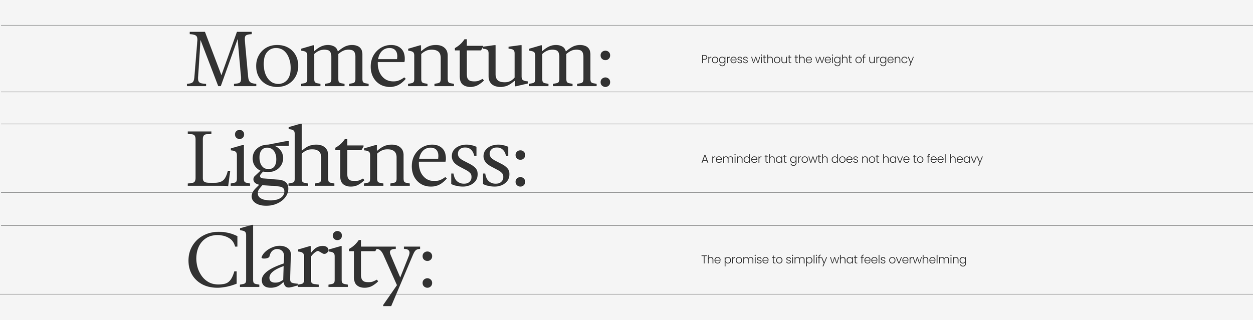
Momentum over urgency. Lightness over gravity. Clarity over complexity. These aren't values in the abstract. They are a filter.
Every touchpoint — from tone of voice to typography to how a headline is structured — was measured against them.
The question was always the same: does this create momentum, or pressure? Does this simplify, or add weight?
Defining the Character
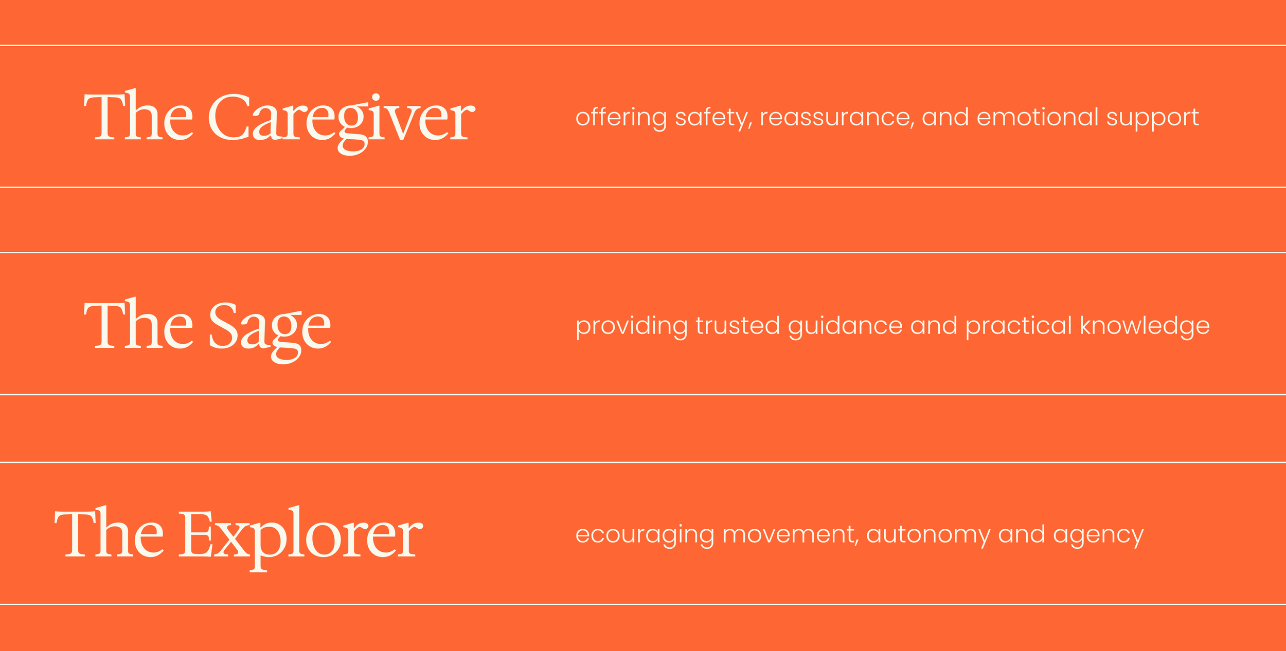
Luma's brand character is built from three archetypes held in deliberate equilibrium: The Caregiver (safety and warmth), The Sage (trusted, earned guidance), and The Explorer (agency and forward movement). The combination matters. Any one of these alone would tip into something familiar and limiting — too soft, too authoritative, or too restless. Together, they produce something rarer: a brand that doesn't rescue you or instruct you. It walks alongside you.
THE VISUAL SYSTEM
Translation, not decoration
Every visual decision traces back to the strategy. Nothing is applied for aesthetic effect alone.
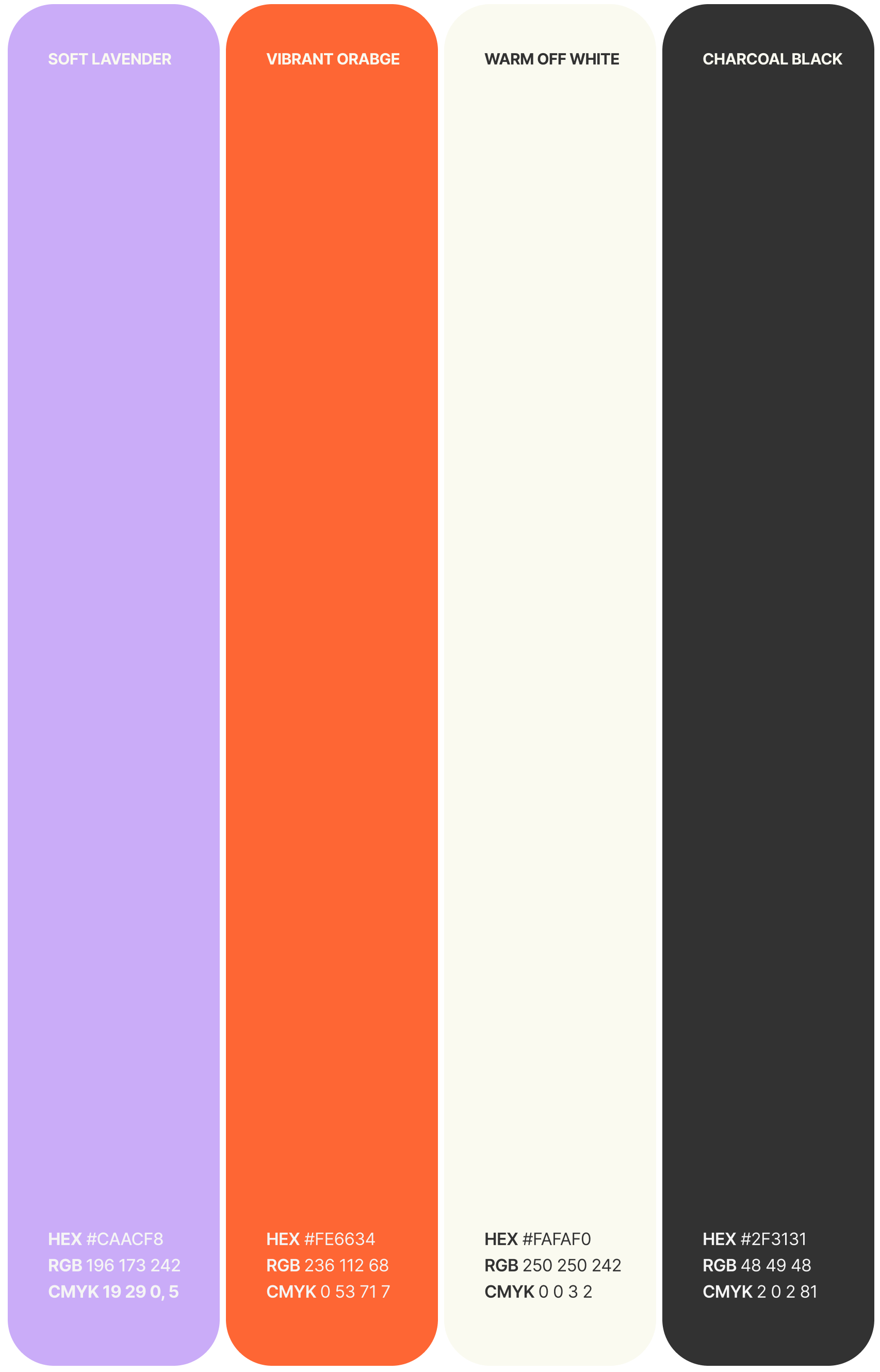
The colour palette — anchored by Soft Lavender and Warm Off-White — creates a quality of stillness. Not passivity, but the specific kind of calm that makes considered movement possible. Vibrant Orange enters as a counterweight: the steady push, the moment of decision, the colour of something beginning.

The graphic language is built around bold, organic forms drawn from natural growth and rhythmic movement. They deliberately avoid the literal — there are no arrows, no upward trajectories, no metaphors for "rising." Personal transformation is layered and non-linear, and the forms reflect that. They suggest change without prescribing its shape.
THE VOICE
The Knowledgeable Friend
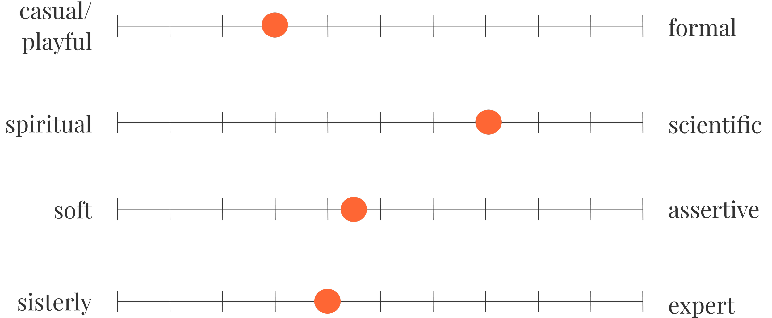
Luma's tone was built around a single, precise distinction: peer-to-peer, not hierarchical. The brand speaks to you, never at you.
In practice, this meant calibrating carefully against two failure modes — the clinical detachment of the corporate world Luma's audience is leaving, and the performed warmth of the wellness space they're wary of. The voice that emerged sits between them: grounded enough to be trusted, warm enough to be felt. It gives information without lecturing. It acknowledges difficulty without dwelling in it. It treats the person it's speaking to as someone who already has what they need — and knows it.
RESULT
A Steady Sense of Direction
The result is a brand identity that does what Luma promises its clients: it creates structure without stifling, and momentum without pressure.
Rather than asking women to become someone new, Luma makes space for them to step into what is already there. Every element — strategy, visual system, voice — is built to support that transition. Not to define it.
SCOPE
Client: Luma
Sector: Professional Development / Mentorship
Deliverables: Brand Strategy, Visual Identity, Tone of Voice