
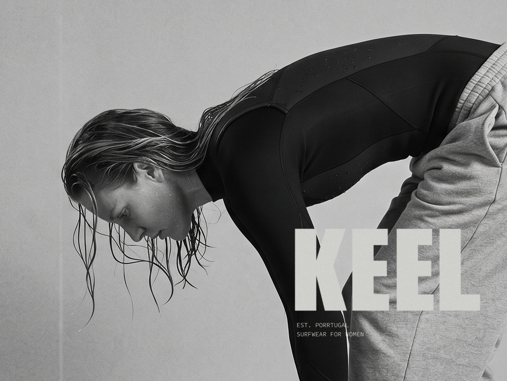
BRAND DIRECTION / KEEL
June 23, 2026
-
I wrote an article about what the surfwear industry gets wrong about women. The short version: way too many times it designs and brands at them. Softer colours, floral prints, silhouettes shaped for appearance rather than function — femininity applied to a product rather than a person considered from the start.
After writing it, I wanted to show what the alternative could look like. Not as a concept exercise, but as a real brand with a real identity, built the same way I'd build it for a client. KEEL is that brand.
-
Description text goes here
-
Description text goes here
The name
A keel is the structural fin at the base of a surfboard. It holds the line under pressure and has no decorative function whatsoever. That's where I wanted to start — something that performs, not something that performs femininity. The name came before anything else.
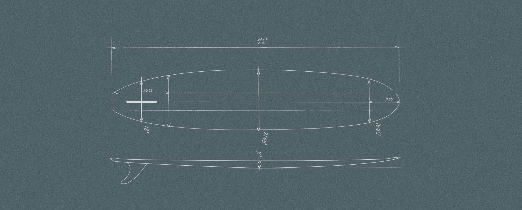
Technical blueprint
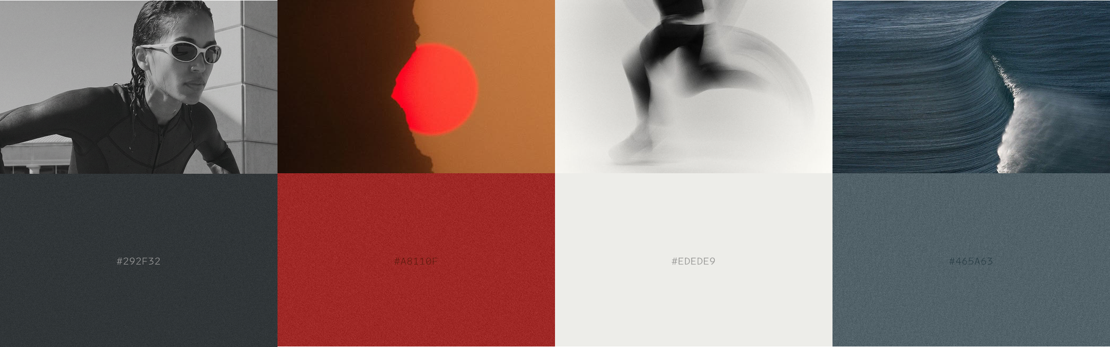
Visual identity
The palette was pulled from the environment rather than the category. Dark water, Atlantic grey, a fiery sunset. Colours that exist in the conditions we actually surf in. The decision to avoid pastels was a consequence of asking the right question first.
Type is utilitarian and direct. The wordmark carries no tagline, because the name makes the argument on its own.
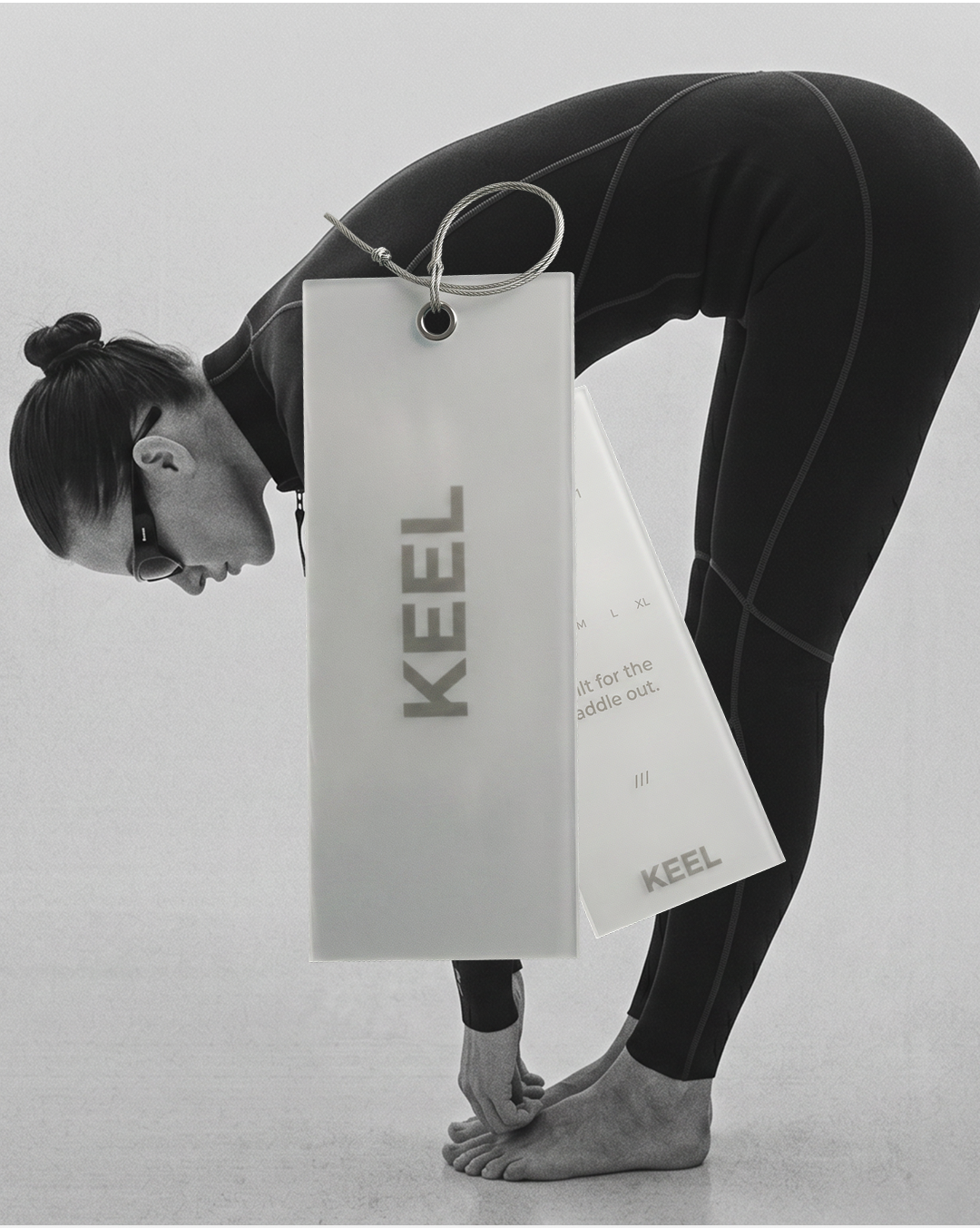
Label design