BRAND STRATEGY / VISUAL IDENTITY/ DESIGN SYSTEM
June 23, 2026
-
Digital mental health brands tend to resolve their central tension by picking a side. Either they lean clinical — rigorous, credentialed, cold — or they lean therapeutic — warm, soft, and light on proof. For we.care, neither was an option.
The platform operates within the strict governance frameworks of insurance and pension ecosystems, which demand professional credibility. And it meets individuals at their most vulnerable moments, which demands genuine human warmth. The brief wasn't to find a balance between these two. It was to make them indistinguishable from each other.
-
What makes we.care genuinely difficult to design for is not the emotional sensitivity of the subject matter — it's the structural complexity of who the brand must speak to simultaneously.
Insurance partners and pension funds need to see professional rigour, governance compatibility, and a brand that reflects the seriousness of the ecosystems they operate in. Individuals receiving care need to feel met — not managed, not talked down to, not overwhelmed by clinical language at the moment they're already overwhelmed. Psychologists and clinicians need to trust that the platform they're working within reflects the standards of their profession.
These are not the same conversation. The brand identity had to hold all three — consistently, and without compromise — by building a system flexible enough to shift tone across contexts while remaining visually and strategically coherent throughout.
-
Three Audiences. One Coherent Brand
The most consequential strategic choice made for we.care was one of deliberate omission.
Standard mental health brand language — "You're not alone," "We're here for you," "Your feelings are valid" — is so pervasive it has become invisible. More critically, it carries real problems: it blurs professional boundaries, and it subtly shifts responsibility away from the individual at the exact moment the individual needs to feel agency rather than dependence.
We.care's voice was built on a different premise: that the most human thing a mental health brand can do is treat the person it's speaking to as capable.
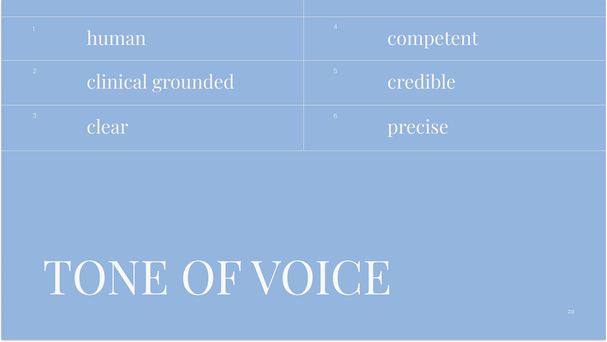
The tone that emerged is direct without being distant, warm without being permissive. Three constants anchor every communication:
Credible — Grounded in evidence and professional standards, never speculative or decorative.
Precise — Concrete language that respects the reader's intelligence and the gravity of the subject.
Human — Addressed directly to the person. Calm, not clinical. Present, not prescriptive.
When we.care speaks, it does not tell you how to feel. It tells you what is possible, and how to get there.
VISUAL IDENTITY
A System Built for Seriousness
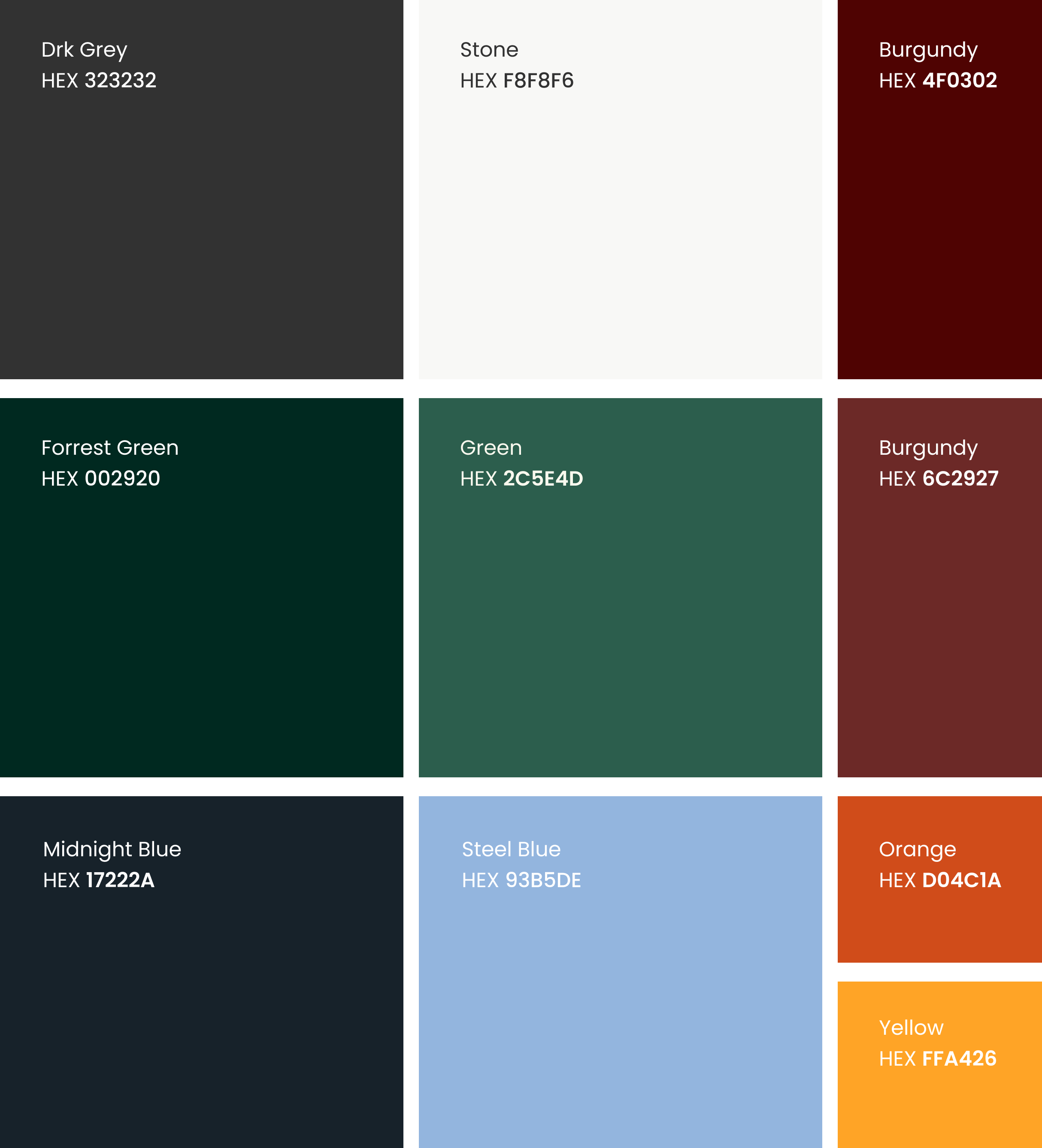
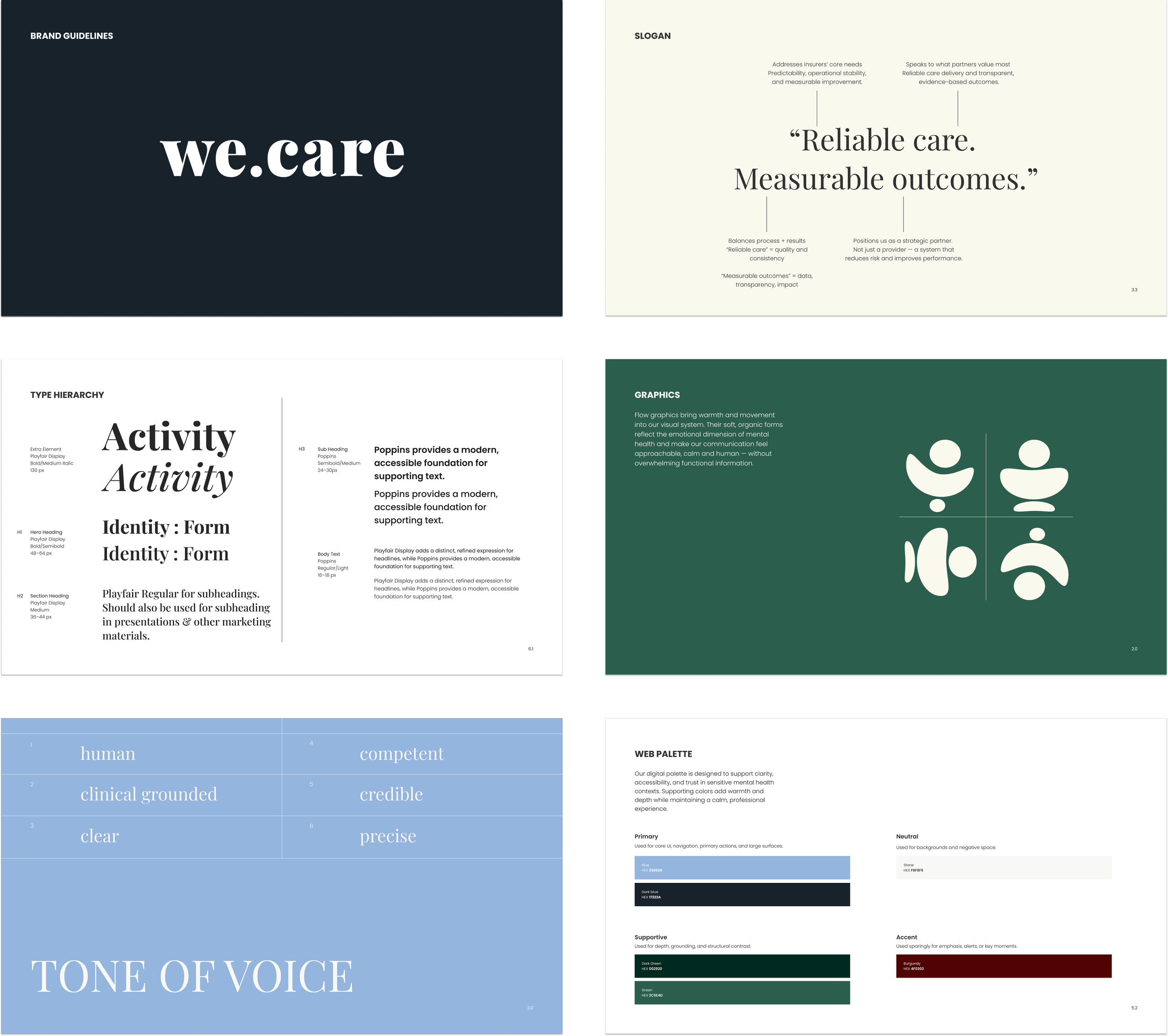
The colour palette begins with Forest Green and Midnight Blue — two colours that carry weight, stability, and professional credibility without the sterility of a clinical white or the coldness of a purely corporate navy. Supporting tones — Stone, Sage, and Burgundy — introduce warmth and depth at the periphery, preventing the system from reading as austere.
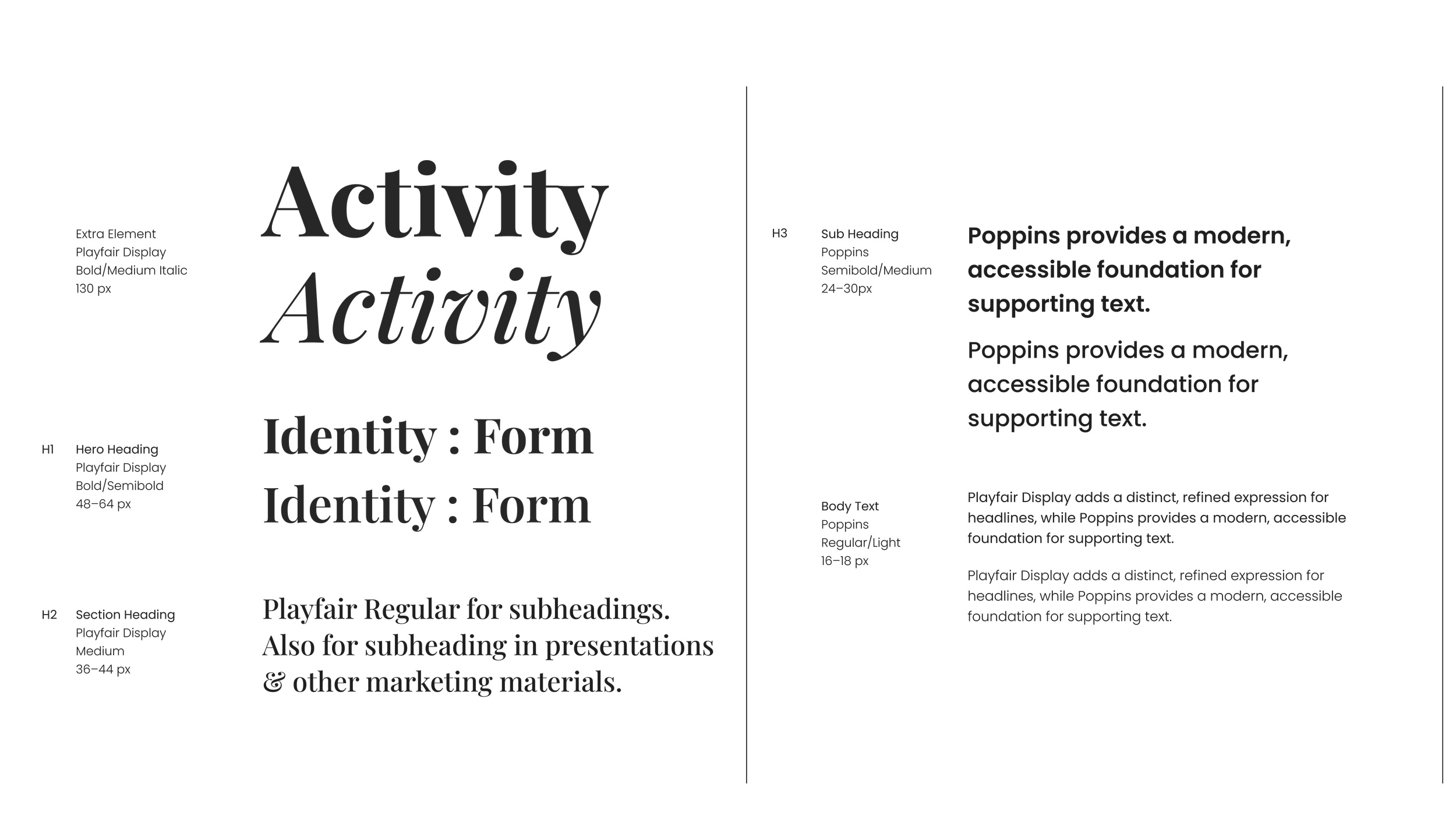
Typography follows the same logic. Playfair Display, a sophisticated serif, carries primary communication — it brings a sense of considered authority, the register of something written with care rather than generated at scale.
Poppins, a clean and highly legible sans-serif, handles functional UI and data — precise, neutral, frictionless.
The combination isn't about variety for its own sake. It maps directly onto the dual nature of the brand: the human and the operational, held in the same system.
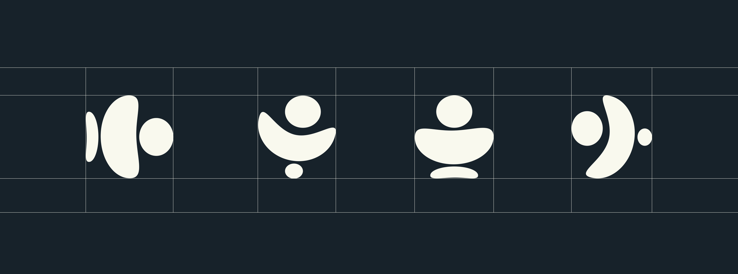
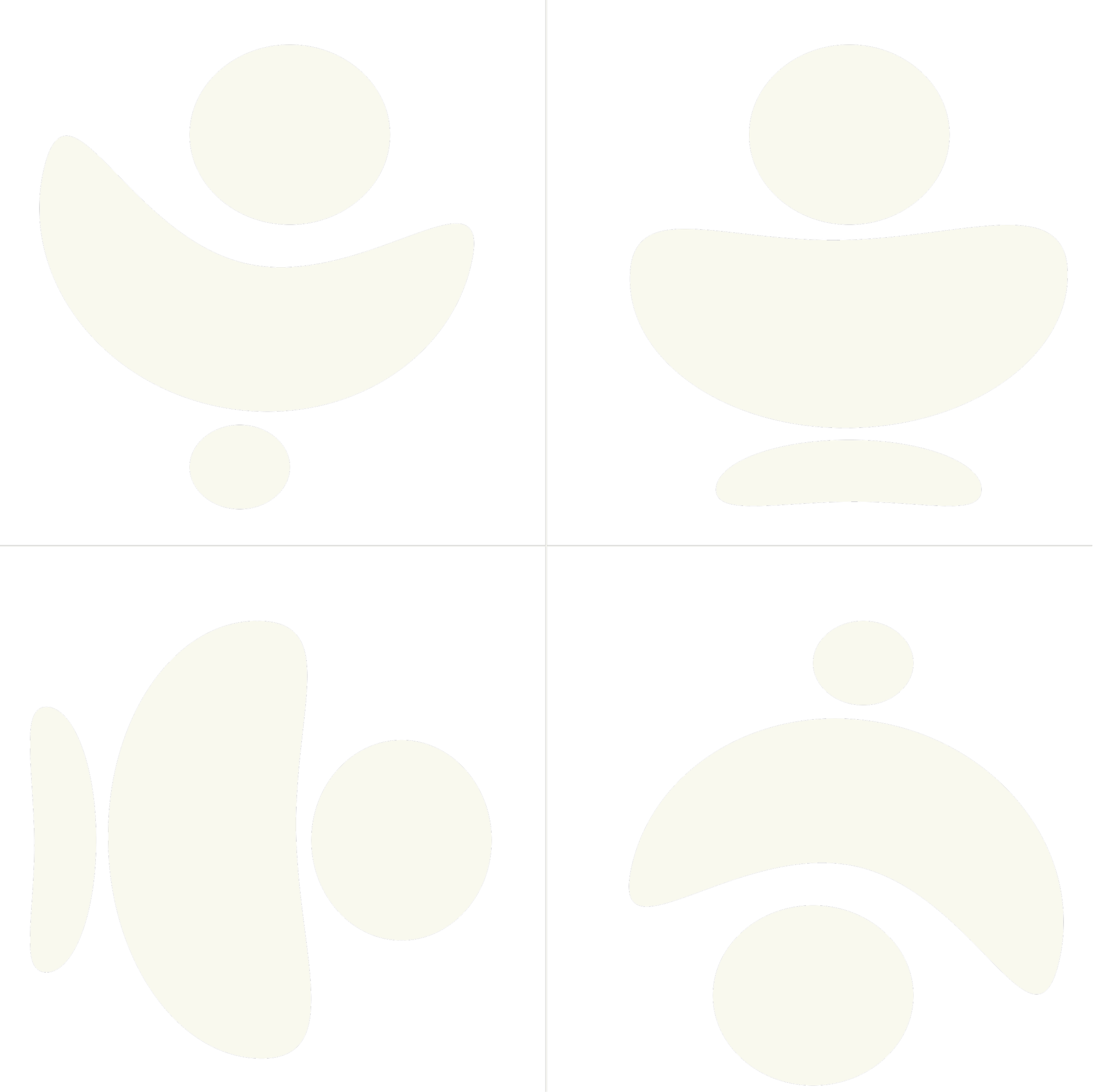
Illustration is monoline and deliberately restrained.
The function is navigational — to guide the user through complex information without adding visual noise to an experience that already carries emotional weight.
OUTCOME
Situationally Intelligent Design
The result is a brand identity that performs differently across three distinct contexts — insurance partner materials, individual-facing touchpoints, and clinical documentation — while remaining unmistakably the same brand throughout. The visual system provides the consistency. The voice framework provides the flexibility.
What we.care demonstrates is that in categories defined by complexity and emotional stakes, restraint is not a design limitation. It is the strategy. By refusing to simplify the tension at the centre of the brief — and instead building a system precise enough to hold it — the brand earns trust from every audience it speaks to, for different reasons, simultaneously.
SCOPE
Client We.care
Sector: Digital Healthcare / Insurtech
Deliverables: Brand Strategy, Visual Identity, Verbal Identity, Design Systems