Unlocking Innovative
Brand Strategies from
the Past
Most brand audits send strategists on a horizontal quest — scanning competitors, charting trends, searching for a gap in the current landscape.
The problem is that everyone is running the same scan. The result is what it always is: a sea of sameness — brands that look, speak, and act like refined versions of one another, each believing they've found a distinctive position by staring at the same horizon. But there's a direction most strategists forget to look: backwards.
The past is one of the few genuinely uncopyable assets a brand can own. A competitor can match your price, imitate your aesthetic, and outspend your media budget. They cannot manufacture 178 years of craft history. They cannot fabricate the cultural memory your brand has already built. Heritage, when excavated with intention, becomes a strategic moat — not a nostalgic detour.
The brands worth studying aren't the ones that chased novelty. They're the ones that went digging.
DATE
March 25 2026
WORDS
studio arata
4 min. read
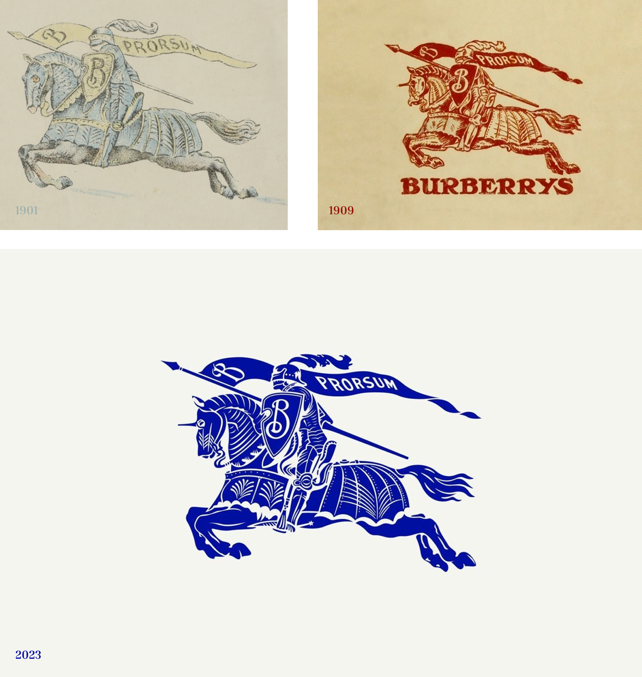
01. BURBERRY
The Return of the Knight
By 2023, the minimalist sans-serif wave had flattened luxury. Brand after brand had stripped its identity back to clean type and neutral palettes in pursuit of modernity — and in doing so, had made themselves interchangeable.
Burberry's response was to go the other direction entirely. They resurrected the Equestrian Knight — a logo from 1901, unused for decades — and reintroduced a archive-sourced Royal Blue that had long disappeared from their visual language.
What makes this more than a nostalgia play is the timing. Burberry didn't reach into their past out of sentimentality; they did it because their past offered something their competitors had voluntarily abandoned: distinctiveness with a legitimate claim. In a sea of brands that looked newly minted, Burberry looked earned.
The strategic insight: when an entire industry moves in one direction, the archive becomes the avant-garde.
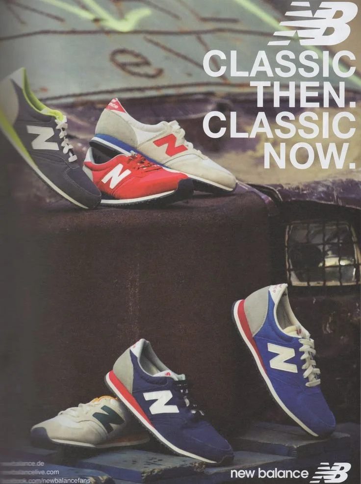
02. NEW BALANCE
New Balance: The Uncool Advantage
For most of the 2000s, New Balance was considered irredeemably unfashionable. While Nike and Adidas chased hype drops and celebrity co-signs, New Balance held its position — functional, understated, stubbornly committed to its heritage of performance and domestic manufacturing.
They didn't try to become cool. They waited for cool to come to them.
By the mid-2010s, a cultural backlash against hype culture was quietly building. Consumers fatigued by artificial scarcity and logo maximalism started reaching for something that felt considered rather than curated. New Balance's unglamorous archive — the 990, the 574, the 1300 — became exactly what that moment needed: objects with genuine history, made without apology.
Their resurgence wasn't the result of a rebrand or a campaign. It was the reward for a decade of not abandoning who they were. The archive didn't need reinventing. It needed patience.
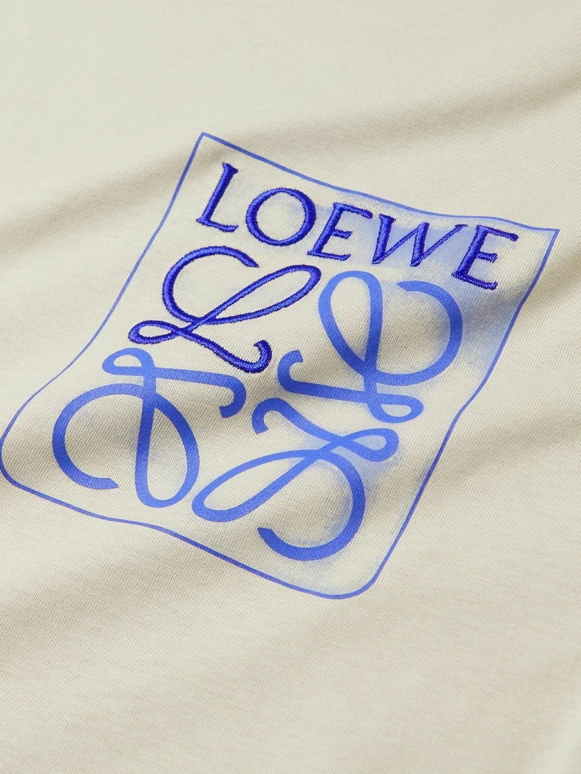
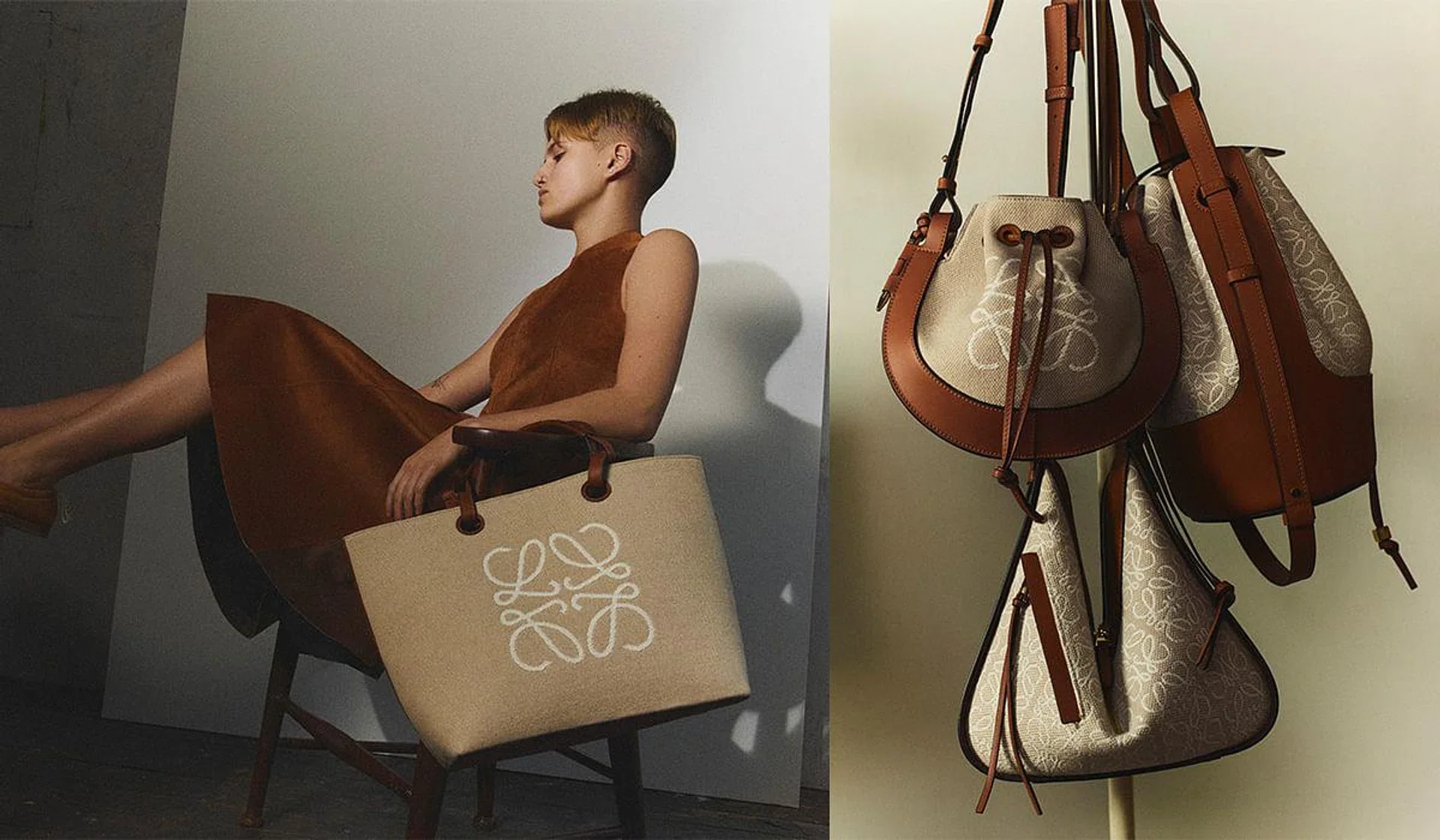
03. LOEWE
The Architecture of Craft
When Jonathan Anderson took the helm at Loewe in 2013, he didn't look at what was trending in Parisian luxury. He looked inward — immersing himself in the brand's 178-year Spanish history to understand what Loewe had been before the market tried to define it.
What he found was a craft workshop. A maker's brand. An identity rooted in the hand, not the logo.
By reintroducing the classic Anagram and repositioning the entire brand around its origins as an artisanal atelier, Anderson didn't just refresh Loewe — he gave it an argument. In a luxury market increasingly dominated by spectacle, Loewe's answer was specificity: this is what we've always been, and it's more relevant now than ever.
The lesson isn't "look to your history." It's more precise than that: find the thing in your past that the present hasn't caught up to yet.
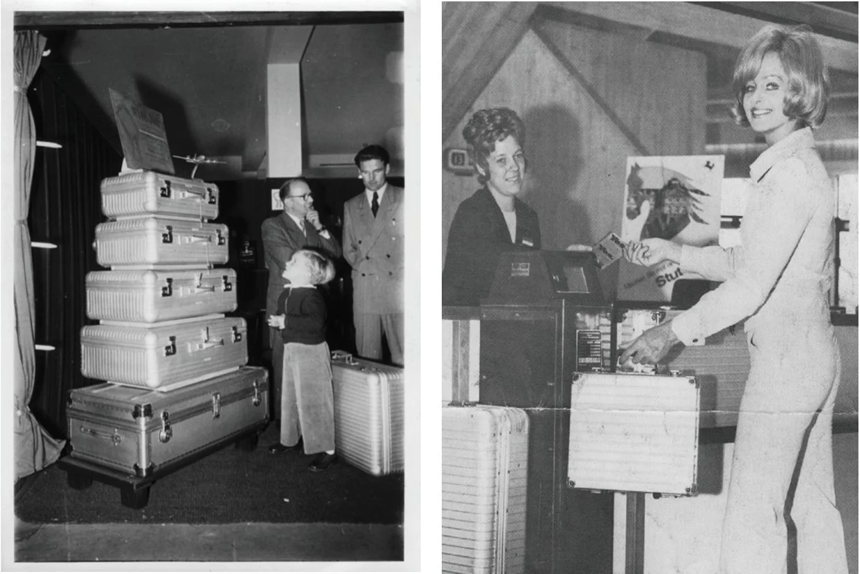
04. RIMOWA
The Industrial Credibility of the Groove
In a marketplace flooded with disposable, logo-heavy luggage, RIMOWA faced a familiar pressure: modernise or become irrelevant.
They chose a third option.
Rather than chasing contemporary aesthetics, RIMOWA returned to its 1930s origins — specifically, the iconic parallel aluminum grooves that echoed the ribbed fuselage of early aircraft. It was a detail most brands would have quietly retired. RIMOWA made it the center of everything.
The grooves aren't decorative. They're a proof of origin — a visible argument that this object was engineered, not assembled. In a category where competitors were racing toward lightness and minimalism, RIMOWA's archive gave them something more durable than a trend: a reason to exist that predated the competition entirely.
Heritage, deployed correctly, isn't about sentiment. It's about credibility that time has already verified.