Stop Designing Women. Start Designing for
Them.
I live in Ericeira. A small Portuguese surf town an hour north of Lisbon, where the Atlantic comes in hard and the water is cold enough that a wetsuit is not optional for most of the year.
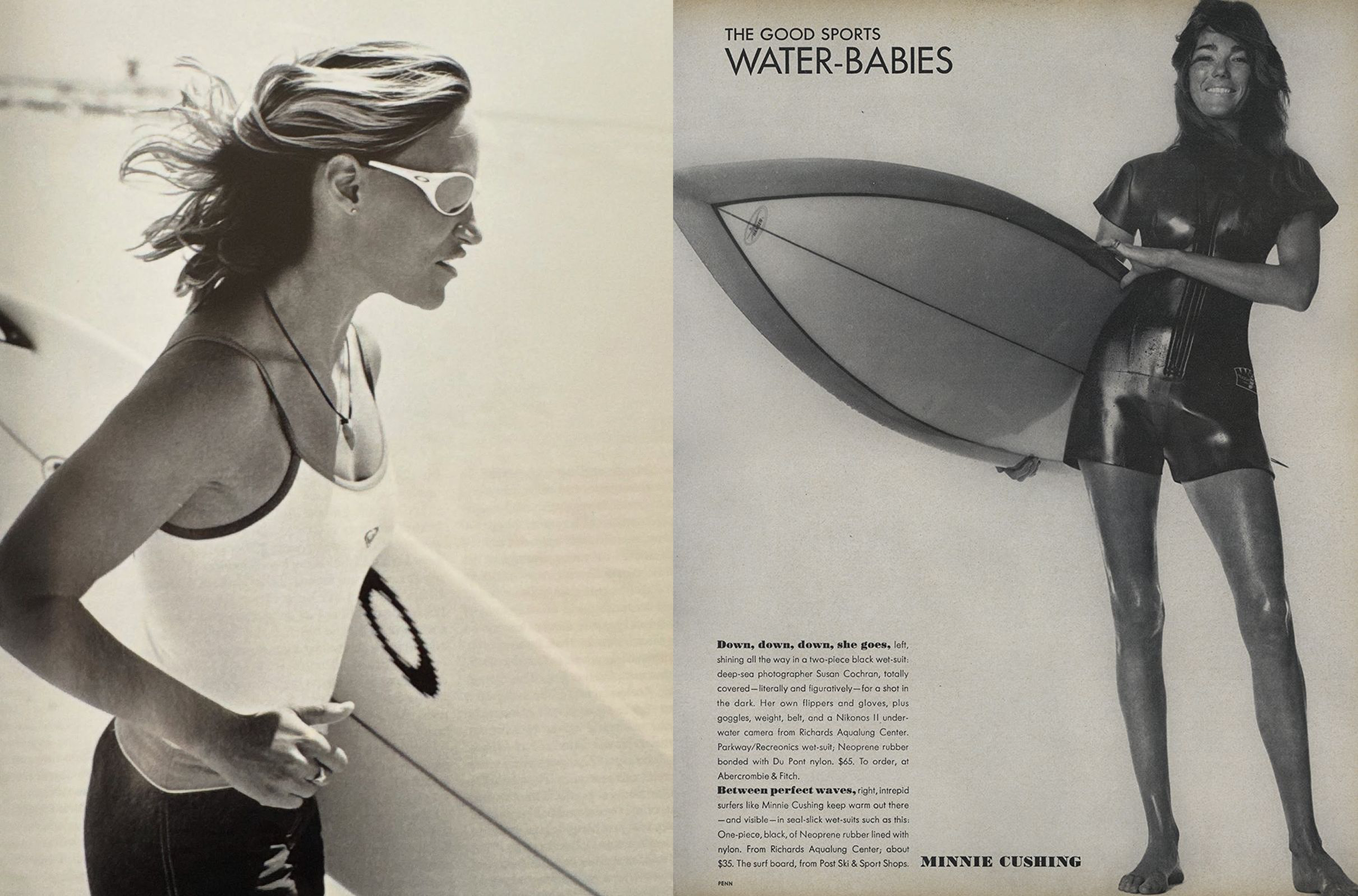
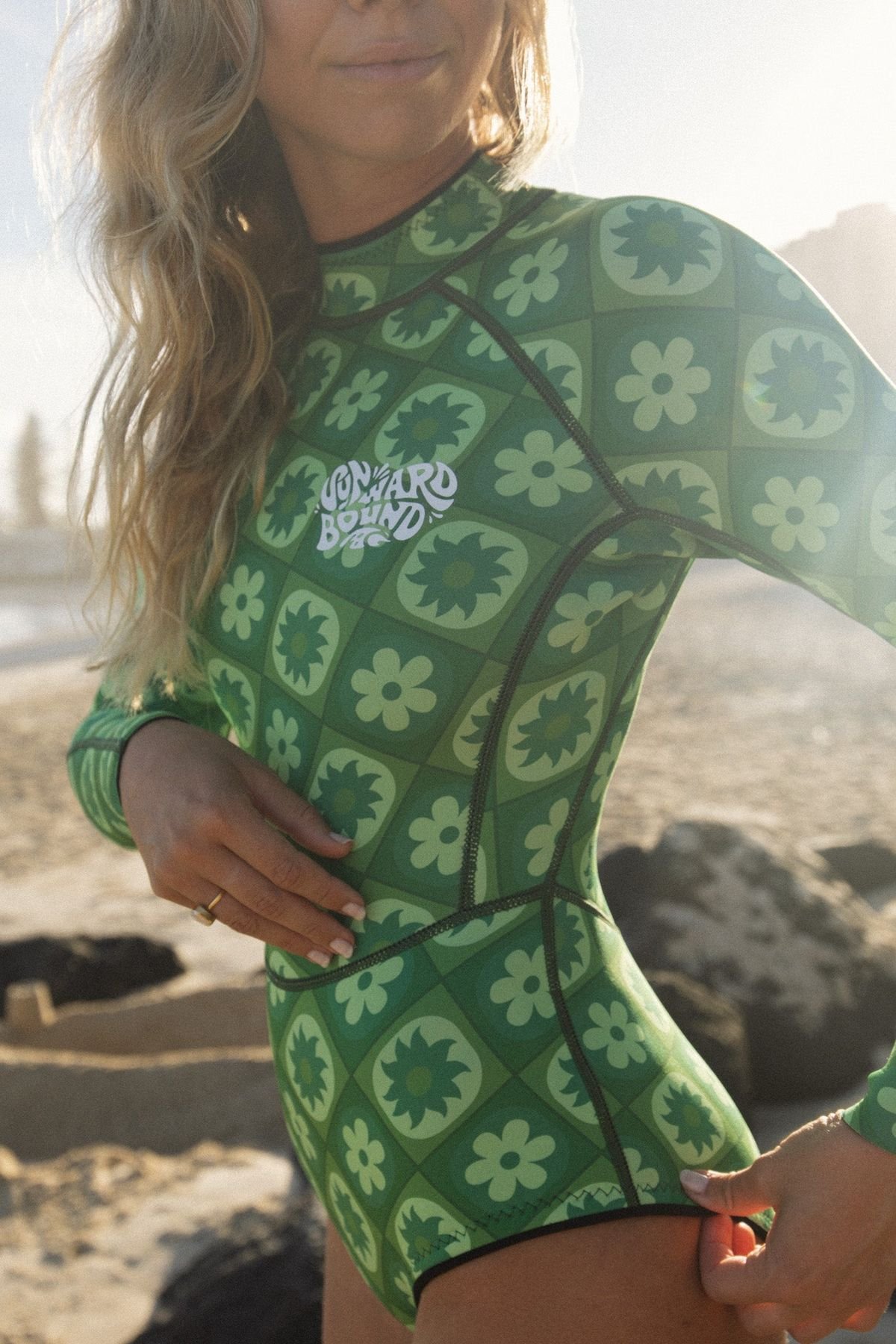
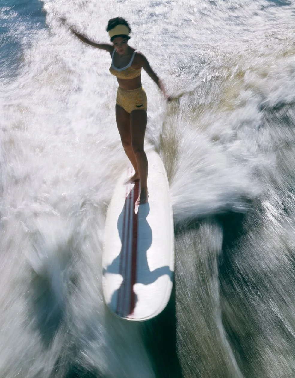
I have surfed a lot of places. Morocco, Indonesia, Nicaragua, Sri Lanka, Australia, the west coast of Denmark. And in every surf shop, in every destination, the women's section looks roughly the same. Flowers. Pastel colourways. Something with a tropical print. The occasional geometric pattern that gestures toward boldness without ever really committing to it.
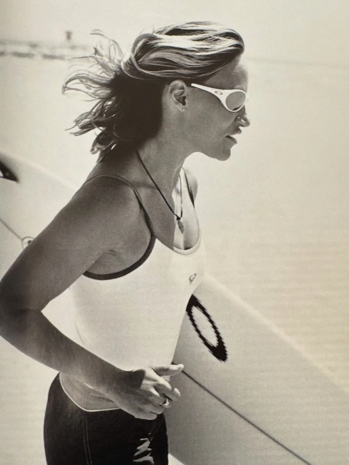
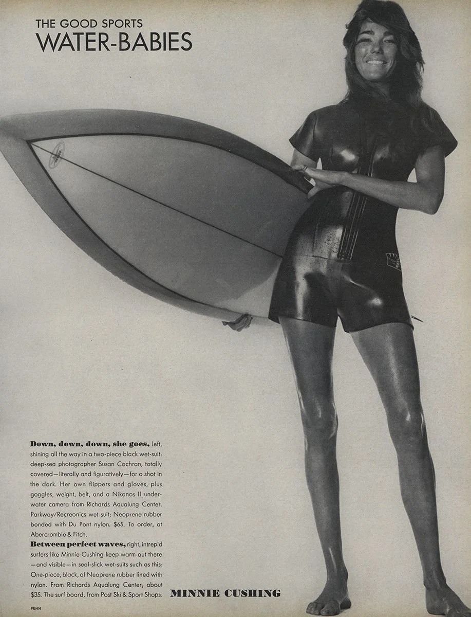
The men's section, is black. Maybe a dark navy. Minimal graphics. Built to perform and designed to communicate exactly that.
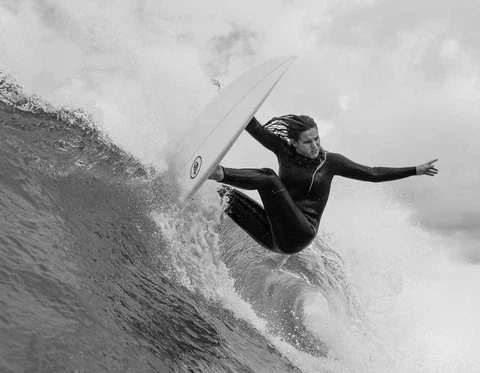
I am not against femininity. In any way. Being a woman is something I am proud of — in all of its softness, its complexity, its depth. But when I am in the water, none of that is what I'm reaching for. When I am paddling out in a big swell, alone, the part of me that shows up is not soft. It is strong, focused, enduring. And the flowers never spoke to that part. Not once.
DATE
May 2026
WORDS
studio arata
3 min. read
The frustration isn't really about flowers. The flowers are a symptom.
The real problem is what the flowers reveal about how the sports industry has historically solved the question of designing and branding for women: by adding femininity markers to an existing product rather than asking what women actually need and want from it. It is a surface solution to a structural question. The assumption underneath it — that women want to be reminded of their femininity even when they are doing something that has nothing to do with it — is both wrong and quietly condescending.
Women in sport are not a niche demographic requiring a softened version of the real thing. We are not a men's product with a floral print and a narrower cut. We move differently, we are built differently, we experience our bodies in sport differently. And more than any of that — we contain contradictions. We are soft and strong simultaneously. We are capable of extraordinary gentleness and extraordinary endurance, sometimes in the same morning.
The brands that have understood this don't split those qualities into separate product lines. They design for the whole person — the one who is all of it at once.
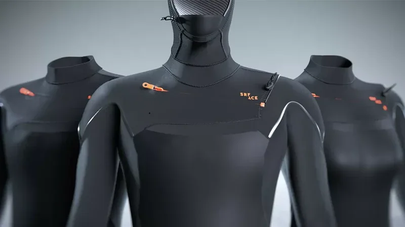
SRFACE, the Dutch wetsuit brand, doesn't have a women's section in the conventional sense. They have wetsuits. The design philosophy is identical regardless of who is wearing them: minimal panel construction, performance-led, stripped of everything that doesn't serve the function.
They have created digital mannequins for every surfer body type — not a male default and a female variation, but a genuine attempt to design for how different bodies actually move in water. The product communicates strength because that is what it is built for. There is no floral version. There is no concession to the idea that a woman in a wetsuit needs to be reminded she is a woman.
That absence is itself a design statement. It says: we designed this for what you are doing, not for how you look while you are doing it. And for the version of me that paddles out at 7am into ice cold water, that is the only relevant conversation.
The brands that get this right are not making a political statement. They are making a product decision — and the product decision reflects a more accurate understanding of who their customer actually is.
She is not choosing between her femininity and her strength. She is not arriving at the beach having decided which version of herself to bring. She brings all of it. The question is whether the brands she buys from understand that — or whether they are still solving for a version of her that never really existed.
The flowers were always a misreading.
What women in sport have always wanted — what I have always wanted — is a brand that looks at what we are about to do and designs for that. Not for who they think we are when we are doing it.
Strong. Focused. Present.
That is not a masculine quality. It is a human one. And it has never needed a flower on it.