Everyone is Designing Imperfection
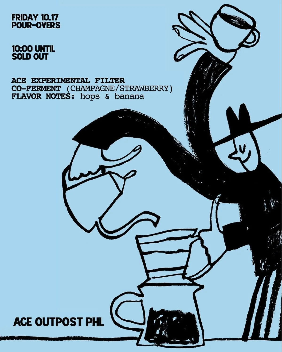
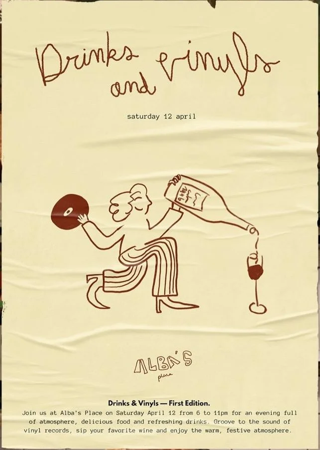
Imagine walking down the street on a Saturday. Any street, in any bigger city really. Stop at the bakery. Pick up a bottle of natural wine. Grab a coffee. Look at the labels, the signage, the paper bags. Wobbly hand-drawn logo. Wobbly hand-drawn logo. Wobbly hand-drawn logo.
Every independent food and drink brand — in Copenhagen, in Berlin, in London, in any city — has arrived at the same visual language simultaneously. Scrawled typography. Scanned paper textures. Packaging that looks like it was sketched in a notebook, then sent to a factory in Shenzhen. The aesthetic of accident, mass-manufactured.
DATE
May 2026
WORDS
studio arata
4 min. read
The biggest design trend of 2026 is faking being real.
Before the critique, it is worth saying the impulse is legitimate. Our hunger for something human is real. The problem is that the response has become its own formula. And a formula, however charmingly imperfect, is the opposite of what it's pretending to be.
We started designing imperfection to escape AI. The fear — felt across every creative industry — was homogenisation. That as generative tools flooded the market with competent, frictionless output, the only way to signal human authorship was to leave evidence of the hand: the wobble, the smudge, the texture that an AI wouldn't think to add.
Here is the problem with that logic in 2026: AI has already learned to design imperfect.
The scanned paper texture, the uneven baseline, the ink-bleed on the label — these are now learnable patterns. The moment imperfection becomes a reproducible aesthetic, it stops functioning as a signal of human presence. It becomes noise. And we are all, collectively, generating the same noise — reaching for the same visual rawness in the hope that it reads as real.
It doesn't. Not anymore. Not when every other brand looks hand-drawn, and most of them aren't.
The question worth asking is not does this look imperfect? It is was this imperfect on purpose — and does the purpose go all the way down?
There is a difference between imperfection as aesthetic and imperfection as evidence. The first is a trend. The second is a record of something that actually happened — a decision, a process, a human being making something with their hands or their specific sensibility.
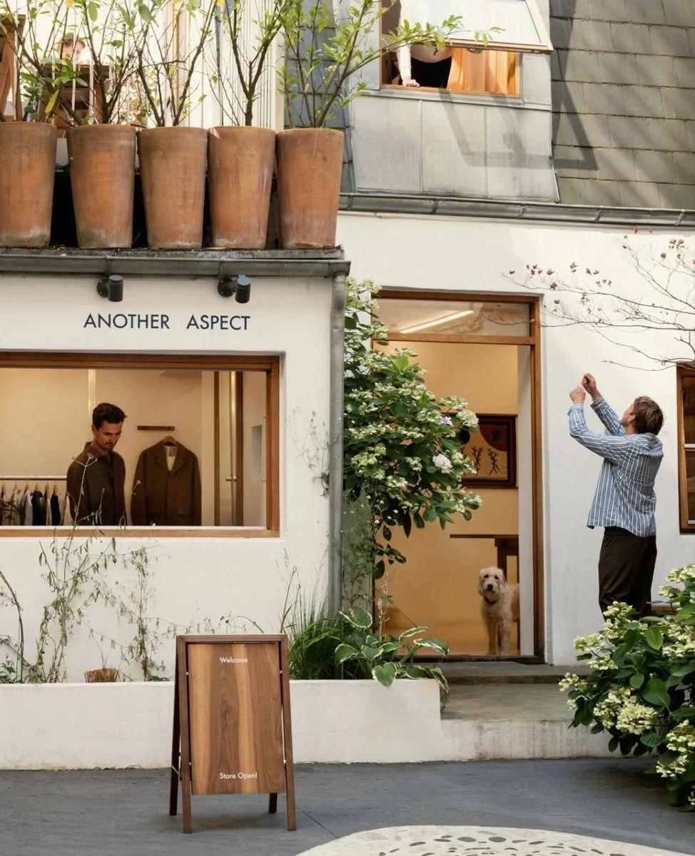
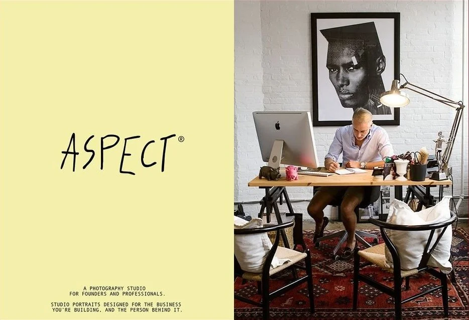
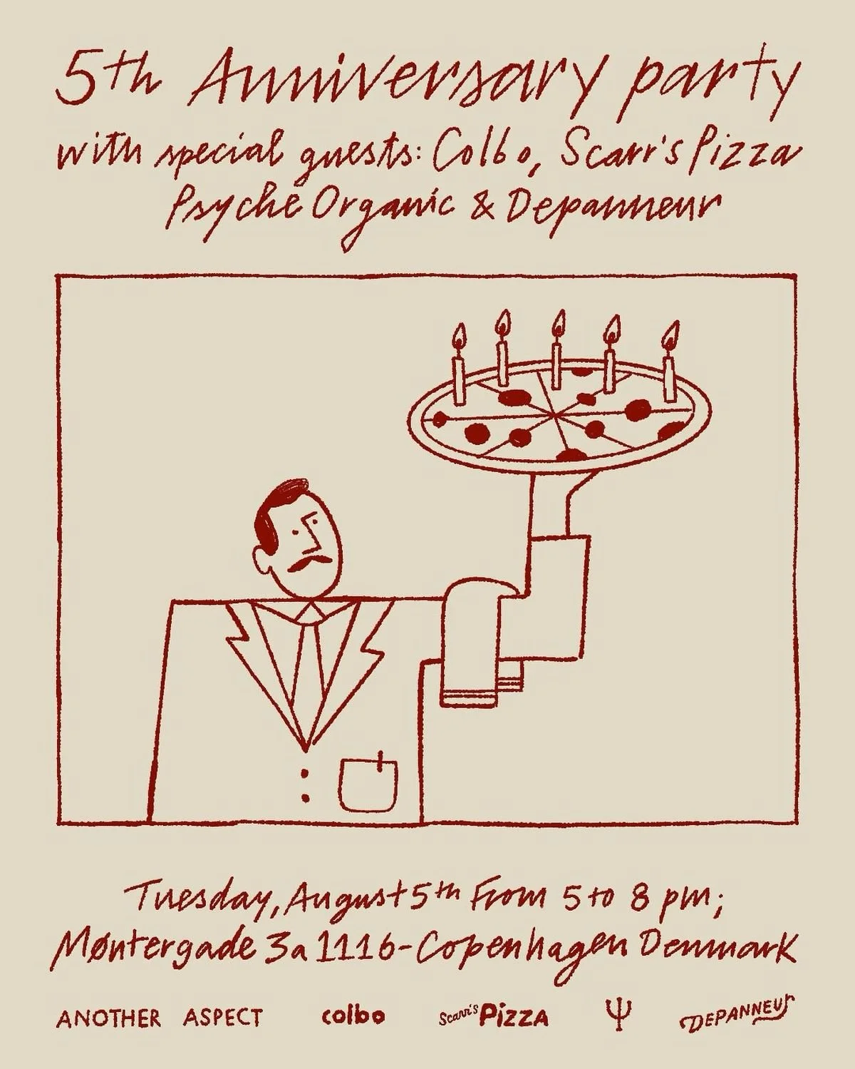
Another Aspect, the Copenhagen menswear brand, operates in that second category — and what makes them instructive is that their identity doesn't look particularly raw or hand-drawn at all.
Before designing their first collection, the three founders walked the streets of Copenhagen asking people about the clothes they were actually wearing — not their style, but their stories. The garments that kept coming up were the ones that had outlasted trends, been worn into something personal. That conversation became the brief.
The visual identity that followed reflects the same logic. It doesn't look like it was designed to escape a trend. It looks like it never noticed the trend existed. That is the distinction the article is really about — not the wobble on the logo, but whether the decisions underneath it trace back to something real.
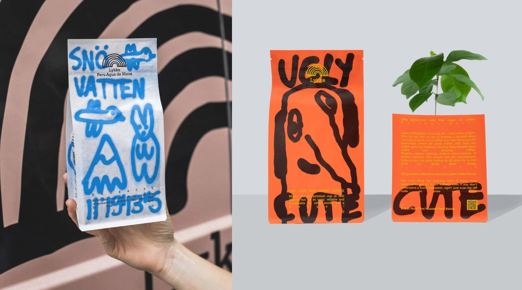
Lykke Kaffegårdar, the Stockholm coffee roastery, went further — they built custom typefaces and bespoke illustration systems from scratch, commissioning work specific to each product. The founder was explicit about the intention: the playfulness was a design brief, not an accident, and not a reaction to what anyone else was doing.
Each product has its own distinct visual expression. The only thing connecting them is the feeling — which is to say, the intention behind every individual decision. That kind of coherent distinctiveness requires a point of view that predates the trend, and it shows.